

How to Make Curtains | Home Makeover Tutorial
Lesson 4: Mastering Fabric Color Theory for DIY Curtains – Warm and Cool Tones
The Transformative Power of Fabric Choice in Curtain Making
Embarking on a journey to create your own custom curtains is an incredibly rewarding experience, offering unparalleled control over your home’s aesthetic. Among the myriad decisions you’ll make, the choice of fabric stands paramount, serving as the very soul of your DIY curtain project. It dictates not just the look, but also the feel, flow, and overall ambiance of any room. Your curtains are far more than mere window coverings; they are significant design elements that can dramatically influence natural light, privacy, insulation, and, crucially, the emotional tone of your living space.
With the freedom to personalize every aspect, from style to material, you possess the power to transform a simple piece of fabric into a stunning focal point. This creative autonomy allows you to craft curtains that perfectly align with your vision. But where do you begin? What color palette will best enhance your interiors? Which texture will lend itself to the desired mood, and what pattern will complement your existing decor? This comprehensive lesson is designed to equip you with the essential knowledge of fabric color theory, focusing specifically on the impact and application of warm and cool colors. Understanding these fundamental principles is key to creating a harmonious, balanced, and aesthetically pleasing home environment. As with any art form, knowing what to choose is just as vital as understanding what to avoid, so pay close attention and prepare to uncover the fascinating nuances of color that extend far beyond simple aesthetics.
Understanding the Foundation: Fabric Color Theory for Curtains
Color theory is not merely a concept for artists; it’s a practical science that applies directly to interior design, especially when selecting fabrics for large-scale elements like curtains. Curtains occupy a significant visual footprint in a room, often serving as one of the first things noticed upon entry. Their color, therefore, can set the entire mood and atmosphere of a space, impacting how light is perceived, how spacious a room feels, and even the psychological comfort of its inhabitants.
The psychological effects of color in home decor are profound. Colors evoke emotions, stimulate senses, and can influence our perception of temperature and space. For instance, certain hues can make a room feel expansive and airy, while others can draw the walls in, creating a cozier, more intimate setting. Understanding these effects allows you to intentionally design a space that not only looks beautiful but also resonates with the desired feeling and function of each room. This lesson will delve into the distinct characteristics of warm and cool colors, empowering you to make informed decisions that transform your windows into works of art and your house into a truly personalized home.
Embracing Warm Colors: Inviting Coziness and Energy
What Defines a Warm Color?
Warm colors are those vibrant hues found on one side of the color wheel, typically encompassing reds, oranges, and yellows. These colors are often associated with sunlight, fire, and warmth, drawing their inspiration from natural elements that radiate heat and energy. They have an inherent ability to advance visually, meaning they tend to stand out and appear closer than they actually are, making them excellent choices for creating a sense of intimacy and engagement within a space.
Characteristics and Mood
The characteristics of warm colors are deeply rooted in our psyche. They are celebrated for their ability to infuse a room with energy, passion, and an undeniable sense of comfort and intimacy. Imagine the rich, inviting glow of a sunset or the comforting warmth of a roaring fireplace; these are the feelings warm colors evoke. They can make a large, impersonal room feel more cozy and welcoming, turning vast spaces into inviting retreats. From stimulating conversation in a living room to fostering a hearty appetite in a dining area, warm colors play a crucial role in setting a vibrant and engaging mood.
Strategic Application in Home Decor
Knowing when and where to deploy warm colors is key to harnessing their full potential. They are particularly effective in rooms that receive less natural light, such as north-facing rooms, as they can visually compensate for the lack of sun, making the space feel brighter and more cheerful. For large, open-plan areas, warm-toned curtains can help to define zones and make the overall space feel less cavernous and more inviting. They are also ideal for social areas like dining rooms and living rooms, where their energetic and comforting qualities can encourage interaction and relaxation. Consider a deep terracotta linen for a rustic feel, a plush mustard velvet for a touch of opulence, or a vibrant crimson brocade for a dramatic statement. These fabrics, imbued with warm hues, can anchor a room and imbue it with personality.
Advantages and Considerations
The advantages of using warm colors in curtain choices are numerous: they create a welcoming atmosphere, add a sense of drama and richness, and can visually warm up a cooler-toned room. However, it’s important to use them thoughtfully. Too much saturation of warm colors in a small space can feel overwhelming or make a room appear smaller and more enclosed. In south-facing rooms that already receive abundant sunlight, an excess of warm tones might make the space feel too hot or visually intense. The key is balance and considering the room’s existing light conditions and size.
Exploring Cool Colors: Serenity and Spaciousness
What Constitutes a Cool Color?
Cool colors occupy the opposing segment of the color wheel, encompassing soothing blues, refreshing greens, and serene purples. These colors are reminiscent of nature’s tranquil elements: the vastness of the ocean, the calmness of a forest, or the crispness of a winter sky. Unlike warm colors, cool hues tend to recede visually, making them ideal for creating an illusion of space and depth, a valuable asset in many interior design schemes.
Characteristics and Mood
The defining characteristics of cool colors are their ability to evoke feelings of calm, serenity, and freshness. They are natural stress-relievers, promoting an atmosphere of peace and relaxation. Think of the tranquil ambiance of a spa or the refreshing breeze on a summer day; these are the sensations cool colors can bring into your home. They excel at making spaces feel more expansive and airy, which is particularly beneficial for smaller rooms or areas where a sense of openness is desired. Cool tones can create a sophisticated backdrop, allowing other elements of your decor to subtly shine, contributing to an overall sense of refined elegance.
Strategic Application in Home Decor
Strategically incorporating cool colors into your curtain selection can transform the functionality and feel of various rooms. They are exceptionally well-suited for south-facing rooms that receive intense natural light, as they can help to visually cool down the space and prevent it from feeling overheated. In smaller rooms, cool-toned curtains can work wonders by making the area appear larger and more open, counteracting any cramped sensations. Bedrooms are perfect candidates for cool colors, as their calming influence promotes rest and relaxation, fostering a peaceful sanctuary. Bathrooms, too, benefit from the crisp, clean feel of cool hues, creating a spa-like retreat. Imagine cerulean silk for a luxurious bedroom, a mint green cotton for a refreshing kitchen, or a lavender sheer for a dreamy nursery. These choices can profoundly affect the user experience within these spaces.
Advantages and Considerations
The primary advantages of cool colors in curtain design include their ability to create a peaceful and sophisticated ambiance, make rooms feel larger, and temper overly bright spaces. However, misuse can lead to a room feeling cold, sterile, or uninviting, especially in north-facing rooms that already lack warmth. It’s crucial to balance cool tones with warmer accents or textures to ensure the space remains welcoming. The intensity of the cool color also matters; a deep navy will have a different impact than a pale sky blue, with darker shades sometimes feeling more substantial and less airy.
The Color Wheel: Your Essential Guide to Warm and Cool Tones
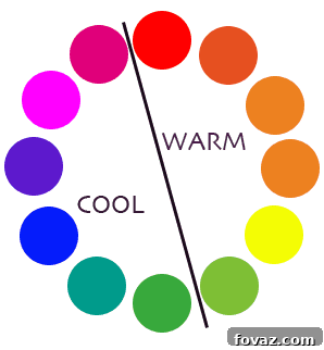
The color wheel is an indispensable tool for anyone venturing into interior design, especially when it comes to understanding the relationship between colors. It visually organizes hues in a circular spectrum, making it easy to discern primary, secondary, and tertiary colors, as well as their inherent warmth or coolness. The most straightforward way to differentiate between warm and cool colors is to visualize the color wheel split directly down the middle. One half will be dominated by reds, oranges, and yellows (the warm side), while the other will feature blues, greens, and purples (the cool side).
You can see this division clearly in many visual representations. For instance, the color chart image via Stella Dezotti brilliantly illustrates this concept, simplifying complex theory into an accessible visual aid:
Beyond the primary warm and cool categories, it’s important to recognize that even neutral colors—such as grays, browns, and whites—can possess warm or cool undertones. A gray with a bluish cast is cool, while one with a yellow or beige undertone is warm. Similarly, a pure white can lean warm (creamy) or cool (crisp, with hints of blue). Identifying these subtle undertones is crucial for achieving true harmony in your decor, as they subtly influence the overall perception of a room’s temperature and mood. By keenly observing these nuances, you’ll gain a sophisticated understanding of how colors interact and how to select fabrics that flawlessly complement your desired aesthetic.
Harmonizing Your Space: Combining Warm and Cool Hues
While understanding warm and cool colors individually is crucial, mastering their interplay is where true design magic happens. Rarely does a room exist purely in one temperature; the most dynamic and inviting spaces often feature a thoughtful balance of both warm and cool elements. The goal is to create visual interest and depth without chaos, making the room feel both stimulating and restful.
When combining colors, consider the existing elements of your room: wall paint, furniture upholstery, flooring, and decorative accents. Your curtains should either complement these elements or provide a deliberate contrast to enliven the space. For example, if your room is predominantly cool-toned with gray walls and modern furniture, introducing curtains in a warm hue like mustard yellow or rust orange can add a much-needed pop of warmth and personality, preventing the room from feeling stark or cold. Conversely, if your space is rich with warm woods and earthy tones, cool-colored curtains in shades of blue or green can provide a refreshing counterpoint, adding a sense of calm and balance.
Think about the concept of dominant and accent colors. Often, a room will have a dominant color palette, with curtains acting as a significant accent. You can choose curtains that echo the dominant temperature of the room for a monochromatic, serene feel, or select a contrasting temperature to create a focal point and inject energy. For instance, in a bedroom with a soft blue (cool) dominant theme, choosing curtains in a slightly warmer, muted gray with a lavender undertone can add depth without disrupting the tranquility. The trick lies in experimenting with fabric swatches in your space, observing how different colors interact under varying light conditions throughout the day. This practical approach ensures your curtain choice contributes seamlessly to a cohesive and beautifully balanced home.
Beyond Color: The Interplay of Texture and Pattern
While this lesson primarily focuses on the profound impact of warm and cool colors, it’s essential to briefly acknowledge that fabric choice extends beyond hue alone. Texture and pattern are powerful design elements that work hand-in-hand with color to define the character of your curtains and, by extension, your entire room. The tactile quality of a fabric can dramatically alter how light is reflected or absorbed, influencing the perceived depth and richness of its color.
For example, a plush velvet, with its deep pile, absorbs light and can make even a vibrant warm color like crimson feel incredibly luxurious and intimate. In contrast, a sheer linen in a cool blue will diffuse light, enhancing its airy, expansive quality. Similarly, the presence or absence of a pattern, and the scale of that pattern, profoundly impacts the overall visual effect. A bold geometric pattern on a warm-toned fabric can inject modern energy, while a subtle floral motif on a cool background might evoke a timeless, romantic charm. When selecting your fabric, consider how the texture and pattern will interact with your chosen warm or cool color to reinforce the desired mood and style. Do you want a smooth, sleek finish to emphasize the color’s purity, or a rich, textured weave to add complexity? The synergy between color, texture, and pattern is what ultimately elevates your custom curtains from functional necessities to captivating design statements.
Practical Tips for Selecting Your Perfect Curtain Fabric
After immersing yourself in the nuances of warm and cool colors, it’s time to translate theory into practice. The final selection of your curtain fabric is a decision that requires thoughtful consideration and a few practical steps to ensure satisfaction.
Firstly, the importance of obtaining fabric samples cannot be overstated. Online swatches can be misleading due to screen variations. Always request physical swatches of your preferred fabrics. These small pieces are invaluable for testing in your actual home environment.
Secondly, observe these fabric swatches under various lighting conditions throughout the day. Natural light can drastically change a color’s appearance from morning to evening. What looks perfectly balanced in bright daylight might appear too dull or too vibrant under artificial evening light. Pay attention to how the fabric’s color interacts with your walls, flooring, and existing furniture. This will reveal how the chosen hue truly behaves in its intended setting.
Finally, consider the light-filtering properties of different colors. Darker, warmer colors tend to absorb more light, making a room feel cozier and more enclosed, and providing excellent light blockage. Lighter, cooler colors, on the other hand, reflect more light, contributing to a brighter, airier feel, though they might offer less room darkening unless paired with a blackout lining. Your decision should align with the functional requirements of the room – do you need maximum light control, or is natural illumination a priority? By carefully evaluating these practical aspects alongside your understanding of warm and cool color theory, you are well on your way to crafting curtains that are not only beautiful but also perfectly suited to your home and lifestyle.
Your DIY Curtain Journey Continues!
Congratulations on completing Lesson 4 of our How to Make Curtains Online Course! You’ve now gained a deeper understanding of fabric color theory, particularly the profound impact of warm and cool colors on your home’s ambiance. This knowledge is an invaluable tool in your DIY arsenal, empowering you to make sophisticated and intentional design choices for your custom curtains.
This lesson is a cornerstone of our free Home Makeover Tutorials package, designed with the express purpose of helping you fill your homes with amazing handmade DIY crafts. Our deepest hope is that these sewing patterns and creative ideas inspire you to embark on a complete redecoration of your living space, ultimately transforming it into the dream home you’ve always envisioned. Imagine stepping into a personalized, stylish sanctuary, decorated exactly to your liking, every detail reflecting your unique taste and effort. There’s an immense joy and satisfaction in the accomplished feeling of saying, “I made this.” Here at DIY Projects, we are passionate about inspiring dreams and encouraging craftiness in all aspects of life. Your journey to a beautifully curated home is just beginning, and we’re here to guide you every step of the way.
Don’t let your creative momentum wane! There are more fantastic tutorials awaiting you in our comprehensive How to Make Curtains Series. Continue building your expertise and bringing your visions to life.
CLICK HERE to Discover Your Next Step! >>
<< CLICK HERE to Return to the Comprehensive Table of Contents
To stay connected with all things handmade, inspired by creativity, and brimming with DIY ideas, be sure to subscribe to our social media channels. Join our vibrant community and never miss out on new projects, tips, and inspiration. Connect with us on Facebook, Pinterest, Instagram, and Twitter. Let’s continue crafting the home of your dreams together!